I'm really enjoying the 'deskspace' but I don't think my Wacom tablet likes it very much LOL! When the tablet is being used on one screen only the dimentions of the tablet are equal to that of the screen but now that I'm using two screens my pen keeps slipping onto the other screen so I can't find my pointer half the time. I'll have to see if there is a fix for that as it can get quite frustrating.
Anyway, here are my covers for August.


Bon Appetit is a menage cover. Unfortunately there are few, if any, good Menage stock images available so it's up to us Artists to whack another body in there. I'm sure if you ask any cover artist about creating Menage covers they will groan in agony before answering LOL! It's not easy finding people that are going to fit together and it can take HOURS of mucking about to find the right match. I'm pretty happy with how this threesome came together though.
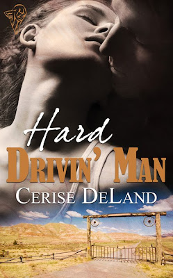
Hard Drivin' Man is a straight forward contemporary Western. I really liked the image of the couple so I'm glad it was accepted.


Lovin' Leela and Bad Boy Back in town are pretty straight forward Contemporary covers.


When the dead speak had a few more elements in it with backgrounds, textures and brushes. This is the second book in the Southern Spirits series so I tried to keep the 'magical' sparkles in the theme.


Aged to Perfection is so simple but I love it. The colours are just so eye catching.
The Bouncer is a darker cover and from memory a Paranormal. Although looking at it now it doesn't really give the impression of a paranormal cover. Apart from the Dark tones that is.


I went for a different feel with Thief and am happy with how it came out. A bit of experimenting with this one :D
And finally Satisfying Olympipa. A bit of cutting and pasting in this one. The horses and the London background were two separate images. I'm happy with how they came together.
