Friday, 11 April 2008

The Big O

Another cover released over at Total-E-Bound.


The Big O by Lyn Cash is the 2nd book in the Kinky Kruising series.

Another sunset and more boobs! LOL. The hardest part was the life preserver. I needed to cut it from the background and change it's perspective, add writing to it and hang it on the rail. It still looks a little off to me. Yes I can see the spelling inconsistency. Shhhh ... don't tell anyone ;) I really should go in and fix it.

I've noticed that I'm starting to dislike some of my previous covers. I guess as I grow, my tastes change. It's funny that it seems to be the covers that I spent the most time on. I was quite proud of those covers at the time. I guess I felt a sense of achievement. Now I seem to look back and think they're overdone. I wonder if that will continue or if I will 'find a happy place' with my covers. Don't know.

That's about it for me. I've got the guilts because I need to get stuck into my Assignment for my Graphic Design course and I've got a few banners to create. All I feel like doing is reading my book Dead after Dark by Charlaine Harris. Well. I guess I'd best get on with it :D

Thursday, 10 April 2008

A Bikers Vow

Another cover has hit the TEB 'coming soon' page.


A Bikers Vow by Carol Lynne is Book 9 in the Campus Cravings series.

This cover required a Harley Davidson on the cover. However, as many of the Bikes available as stock tend to remove the badges (for copyright reasons I presume), it was a bit of a guessing game. I ended up with something that looked 'Harley-ish'. As a reader looking at a cover, a bike is a bike is a bike LOL! I get the idea. If it isn't a Harley I don't think I'd throw the book down in disgust.

Aaaanyway, the Tatts and Piercings were a big part of this cover. Thank goodness the Tattooed male came as is. I really only had to add his long hair and nipple ring. Not that you can really see that. The little fellow at the back was more tricky. He had to be 'small' and slim but well muscled. He also had to have nipple rings and a belly-button piercing. Not much thought process used in these covers as I'm limited by the series template. Just a lot of fiddling to get the characters to look right.

Been a busy month for covers. My publisher/editor at TEB is heading off to a conference so I needed to have the months covers back to her early. I've only got one to go, so I'm on track. I also had to re-do some older covers that will be going to print very soon. Originally I used to create three separate files (cover, spine, back) instead of the one cover-spread that I do now. So I just had to pull all the parts together into one file. It was all pretty straight forward thank goodness :D

And as you can all see I've been getting my Blogger account back up to date. I think I've worked out the kinks and I've managed to add some personal touches. Thanks so much to Amarinda Jones for helping me with the slideshow!!

I'll be working on some banners that I've promised people once all the covers are out of the way. I haven't forgotten ladies!! :D

Monday, 7 April 2008

Back with Blogger

Okay. I've donned my battle fatigues and am back with blogger LOL!

I've been working out the kinks, copied over a few of my posts from Wordpress, got some snazzy little widgets happening and all's good.

Let's hope there's no more moves :D

Hunting Diablo

So I spent most of my evening checking out the available Blogger templates. I want a 3 column template with a custom header. Apparently these don't exist. Well, I did find some but for some reason Blogger can't read them. Kinda makes the search for Free Blogger Templates pointless. I might have to resign myself to a 'classic' blogger template/layout, which I seem to recall being one of the reasons I hightailed it over here to Wordpress. *sigh* Man this internet thing is SOOO time consuming.

Of course I say to myself 'Damn-it woman! You should be able to put a simple template together'. So I start fiddling around and the next thing I know it's midnight and I've accomplished NOTHING other than getting myself extremely frustrated. Yeah, so I'm no closer to getting my Blogger account looking professional so we're still here for the time being.

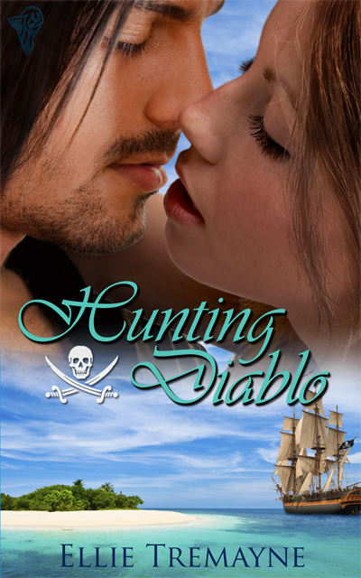
Anyway, on to other things. Hunting Diablo has hit the 'Coming Soon' line-up over at TEB.

hunting-diablo.jpg

Ellies other covers by me ;)


Hunting Diablo by Ellie Tremayne. Ellie has done a little sidestep away from the rugged British highlands and thrown us into the Carribean full of Pirates!

It's actually be quite a while since I did this cover and I was beginning to worry that it may never be released LOL! I was rather pleased with the outcome. I love the colours. Can you tell that the couple are actually two different stock photos? I'm pretty chuffed with how they came together. Actually I think it may have been 3 stock photos in this. I think I added someone's chest hair and shoulder so that their heads weren't just hanging there :D

How nice would it be to spend a week on that little island, eh? Provided Mr Pirate up there was waiting on me hand and foot ;) LOL.

I seem to recall there was a lot (a LOT) of cutting out on the ship. Not something that I want to repeat within the near future. However, it came out surprisingly well. I just had to add the Jolly Roger flag and get the ship to sit in the water without looking odd. I think I managed it, provided we don't look tooooo closely ;)

Hmmm ... very odd. I've come back to finish off this post and something's changed. I've all of a sudden got a personalised Dashboard. There also seems to be a few bugs. I can't put in any links for some reason. I like the new look but I don't like being able to do what I want, when I want. Also I don' like things changing without a bit of fanfare. If something is going to be up-graded I want a small note saying something along the lines of 'Look what we've done'. So I'll finish this post off because I can't really do any more to it. Let's see if it is going to be difficult next time around. If so, Blogger, here I come!

Worth the Risk

Phew! Another cover has been released in the 'Coming Soon' section at TEB. I was beginning to get antsy as I had nothing really worthy to blog about. Well, other than the mundane grievances of life LOL!

worth-the-risk.jpg

nothing-to-lose.jpg

Worth the Risk by Jamie Hill is the second book in the Unexpected Love series.

I tried to keep the same 'style' to the covers and think I managed it pretty well. Took a while to find the right mix of models and I particularly like the woman and was quite determined to use her. Very straight forward . Not too much blending or adjusting.

Just ordered myself a couple of books online - Dead Until Dark and Living Dead in Dallas by Charlaine Harris. Yeah, it's taken me a long time to get around to reading CH. It seems it's a must that everyone who loves Vampire books will have read this series. My interest was piqued by the fact that there's a new TV series coming that's being based on these novels called 'True Blood' . Yay! Another vampire show with an Aussie, Ryan Kwanten amongst the leading characters :D Mind you we'll probably only be teased with the first few episodes and then the network will just stop airing it without a 'don't mind us'. And yes, I'm still ticked off about Moonlight!

I'd love to see Sherrilyn Kenyon or JR Wards series on the TV but that may be pushing the friendship a bit.

Happy Easter!!

First things first ... HAPPY EASTER!! (yes I'm a bit late for the Aussies)

happy-easter-sepia.jpg

Just whipped this up because I couldn't find a suitable image on google LOL!

Oh, and get a load of this!!! The Belgian chocolate made the chocolate egg with at least 50.000 bars.The egg measured 8.32m high.Twenty-six craftsman worked altogether 525 hours to build the easter egg. They needed 1950 kg of chocolate.Alderman Urbain Vercauteren of the city of St.Niklaas said the egg wasn't meant to be eaten.He said: "After a week outside in all weather conditions, I don't think it would be very tasteful."

So, now that we've indulged ourselves, I can tell you that not much happening in my small part of the world. I've done my covers for the month but they're just taking their time being released. I'll post them here as soon as they're released over at TEB.

School Holidays are looming in a few weeks. Don't know how I'm going to entertain the kiddies. Luckily my son will still be attending Preschool for his 3 days a week. The idea crossed my mind to head off to Sydney for a week, but it's such an upheaval with all the packing and the 5+ hour drive down there. It's hard when it's just me in the car as my son still get's a bit car sick. Although he is quicker to grab the 'chuck bucket' these days.

So I might take my daughter horse riding and shopping. Maybe we'll visit the movies and she's been mentioning Ice Skating but I'm not sure how my old bones would hold up to that LOL!

Speaking of my daughter, she had a sleepover at her cousin's last night so I'd better head over and pick her up before she wears out her welcome. Oh, and I must drop in and apologise to my neighbour as I forgot to set my alarm this morning (6am) for our morning walk. It was nice to sleep in though ;)

Mistress Mine

Here's the latest cover to be released over at TEB.

mistress-mine-cover.jpg

Mistress Mine by Lyn Cash is the first book in the Kinky Cruising Series. It was an odd combination - a cowboy, a dominatrix and cruise ship and because of this I wanted to try to get all elements in the cover. I did muck around for a while, trying different things but this combination seemed to work the best. I added the leather cuffs to the woman and hair to the guy, removed some tatts. Oh, I also gave him a shave LOL! Something I haven't done before but apart from that it was all pretty straight forward.

Pleasing the Messenger

Oooh ... that was quick! Pleasing the Messenger cover has been released over at TEB.

pleasing-the-messenger-reduced.jpg

melting-the-minerals-cover-reduced.jpg daring-the-underworld-reduced.jpg tempting-the-law-cover-artwork-reduced.jpg

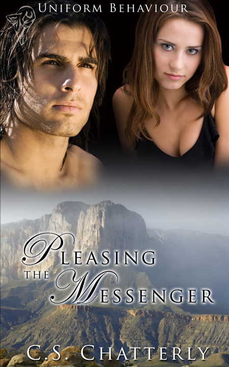
Pleasing the Messenger by C.S. Chatterly is Book Three in the Uniform Behaviour series. Can you tell? LOL. I am hoping this is it for the series because I'm starting to have trouble finding suitable male faces. The hardest part of being a cover artist is finding stock. Then to add to my stock woes is my personal taste. All these guy's I find extremely attractive. Yes. There were other men in suitable poses but I just couldn't bring myself to use them because they didn't appeal to my taste. Sad really. But that is how the cookie crumbles. *sigh* One day I'll get myself a good camera and perhaps (perhaps) hire a couple of models to create my own personal stock. Stock that hasn't been used to death.

Anyway, back to the cover. Took a little while to find the male model. The first guy I had was a bit young but Claire and I managed to scrape up this handsome young fellow. Hmm .. nice jawline.

Then came the battle to find a suitable scene on the bottom. The story is set during an ice storm in Eastern Texas. I tried to keep the terrain as realistic as possible, hence a Texas mountain image (mind you I have no idea if there are mountains in Eastern Texas) Ah the joys of artistic license LOL!. Unfortunately no sign of ice/snow but I guess we can't have it all. Right? :D Anyway, I think it works well for the series. Two covers with the 'snow' effect would have been too much I think.

Well. I'm off to try and come up with a worthy Blog entry for Hitting the Hot Spot on Sunday. OMG! I have no idea what I'll blog about. Well, covers of course. Duh! But in what context, I'm not yet sure. Any ideas?

Office Advances

Here's the latest cover released at TEB!

office-advances-reduced.png

Office Advances by Carol Lynne is book 8 in the Campus Craving Series so there's nothing new to the layout. This one is based more in the business sector, hence the city backdrop and the guy's in suits. That's actually Sydney up there - had to support my home town LOL! The guy's were easy enough. All I had to do was add some curly hair to the guy at the front but it's hardly noticeable. Yeah. So after the initial searching for suitable stock that had the guy's giving off the right vibe it all came together rather easily.

Port Stephens & Sensual Spell

I'm back! Had a very nice time. The house we stayed in was right on the bay. Here's my lazy attempt at a panoramic view LOL. I took looking out from the back door. Unfortunately it was the day we were leaving and the weather was crappy - typical! Every other day had been gorgeous. But you get the idea.

Salamander Bay

We fed the pelicans, watched the dolphins, went swimming, got sunburnt *rolls eyes*, ate well, drank well. *sigh* Yes. We had a good time :D It is good to be home though. I was a bit over the upheaval of all this recent travel.

Aaanyway, so back to the real world. I've just punted the kiddies off to school and preschool. Hallelujah and pass the gin! Would you believe they almost didn't make it. Of course with all the rain we've been having here the bridge went under last night (flooded). It was lapping at the bridge when I drove the kids over this morning. Goes to show how desperate I am to get them out of my hair! LOL. Yeah, I know. I'm not much of a mother. Hubby and Grandpa are over on the 'other side' so it's not like I've just dumped them and headed for the hills ;)

I have another four covers lined up with TEB so I'll be working on those this week. In between trying to track down a new vanity for the bathroom :D YAY!! OH, and it seems hubby is feeling rather generous at the moment (must have been the week off work ;)) He's ordered me some new flooring from our shop! At the moment we've got old lino (or Linoleum for non Aussies) in the kitchen/dining and filthy, filthy carpet in the lounge.

With two kids endlessly vomiting, spilling red drink and many other things, drawing, traipsing mud in well you can imagine what it looks like. It's to the point where I'm too embarrassed to have someone come in and professionally clean it. And then there's the nice little flea ecosystem that has set itself up in there, thanks to our two cats. Yes carpet, it's time to GO!

So life is good or will be, once the work is done :D

Alright I have a new cover just released as 'Coming soon' over at TEB ...
Sensual Spell

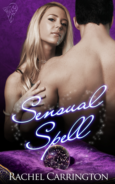
Sensual Spell by Rachel Carrington - I enjoyed this cover and it came together pretty easily. This is pretty much what I had in mind from the start, although the heart sparkles are looking a bit weak now that I look at it. Still, I think it's effective :D It really is getting hard to find stock models with expression on their face. This woman is what I wanted, cocky, sure of herself, cheeky and content (well, who wouldn't be considering what's in her arms). Most of the stock models look like they've had an overdose of Botox. Ugh! I'd better not bore you with my 'stock' gripes.

Well it's pouring down again so it's not looking good for 'kid free' time over the next few days. Then again, if they get stuck over the 'other side' with dad & grandpa ... well, let's just say that I won't be too heartbroken ;)

Nothing to lose? Hello!!

Well we're off to Port Stephen's in the morning. *sigh* I really don't want to go. Not that I don't want to catch up with our friends, but I'm just over all the upheaval, packing and driving. We're basically driving back to Sydney! LOL. Oh well.

Guess I'll leave you with the latest releases over at Total-E-Bound:D

Nothing to Lose

Nothing to Lose by Jamie Hill. This was one of those covers that I just couldn't get into. I think the whole 'handyman' thing threw me and I got too wrapped up in the 'renovation' picture that I had in my head. Didn't matter what I did it looked wrong so had to take a step back and simplify it a bit. I also had a different guy in a singlet top. He looked a lot more 'handy-manish' but also a bit boring LOL! So I replaced him with Mr Sack-of-Potatoes and ta-da ... schmexy cover ;)

Hello

Hello by Dakota Rebel. Simple and straight forward this one. This is pretty much the image I had in my head from the start. I'm happy with how it turned out. I think I originally had a white background but the red, white & blue gives it a whole 'Do it for your country' thang going for it LOL! Even her fingers remind me of the stripes on the American flag .. ha ha! The model originally had blue tinsel wrapped around her so I had to cut that out and paint in her fingers and add the phone to her hand. Worked out pretty well if I do say so myself :D

Well, time for bed. Will catch up with you all next week. Cheers!

Melting the Minerals

Oh dear .. what a sad day it is for the Australian Film industry. Actor Health Ledger found dead in his NY apartment of an apparent drug overdose. Silly, silly boy *shakes head in disbelief*. He was 28! What a wasted life.

Well I'm not going to dwell on it. He was a bit of a strange one but that was probably the drugs. What a dreadful time it will be for his family and young daughter. It's hard enough dealing with these sorts of things in private, let alone having it all splashed across the world news.

Oh well. RIP Heath! May you have learnt your lessons in this life. Onwards and upwards and all that.

Okay on a lighter note here's the latest cover to grace the pages of TEB's out soon page.

Melting the Minerals

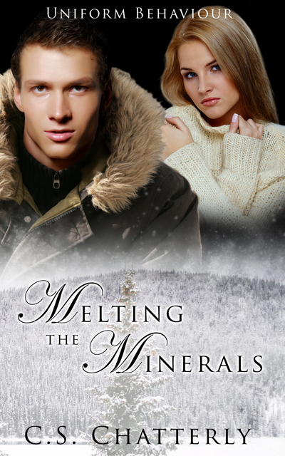
Melting the Minerals by C.S. Chatterly (Book 3 in the Uniform Behaviour series). I really like the style of these covers and have been really happy with how they've all come together. Again this one was quite simple although I did have to add the guy's head to the woolly jacket LOL! I used a similar technique to create the snowy effect as I did for the fire in Daring the Underworld. I just removed the colour :D So there it is, a simple yet effective cover.

Now I also want to congratulate Total-E-Bound on getting 5th place in the P&E awards. 5th out of 107 publishers and they've only been up and running for approx. 6 months! The team at TEB are just so helpful and professional. It's a fantastic team to be involved with so why don't you head on over and check them out!

The TEB Chat over at Nightowl yesterday was fun and very encouraging. Everyone seems really happy with the standard of covers which is great. It's nice to know we're on the right track LOL!

So Dakota was thinking about taking a week off, however, seems her muse has other ideas http://vampsmut.blogspot.com/ and just why is Amarinda walking around the neighbourhood with her clothes on inside out, prey tell? http://amarindajones.blogspot.com/

Cupid and Karaoke

Two more covers released over at TEB ...

karaoke-at-the-tumbleweed-cover-reduced.png cupids-kisses-cover-single-reduced.png

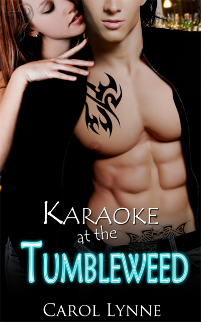
Karaoke at the Tumbleweed by Carol Lynne

Gee, don't you wish all Barmen looked this good?? LOL

This one was needed quite quickly. I had the idea of what I wanted pretty early so it was just a matter of finding the right models. I'd been eyeing these two off for a little while now ... well, one in particular ;), and I'm surprised how well they came together. She was hanging off another fellow but he was wearing too many clothes ;)

Okay, so what have I done here ... I removed the poncy buttons from his cardie and of course added his tatt's and longer hair. I thought she looked a little odd just hanging there with no bottom half so I searched around and found her a hip *rolls eyes*. Yeah, I know I've practically covered it over but I don't like missing body parts ;)

Also her skin was a bit mottled. Actually she looked dead, so I airbrushed a bit of life back into her. I also managed to scratch up a bar/pub background and fussed around with the fonts to get a Neon feel and Voila! Karaoke at the Tumbleweed :D It is a nice change for Carol who usually writes M/M, so I hope she likes it.

The Cupids Kisses covers a couple of short stories - hence the Title & Author. This will cover Dirty Cupid by Lexie Davis, Attitude Adjustment by Bobbie Russell, To Catch a Cassanova by Erika Scott and Redemptions Incubus by Brynn Paulin. The sexy guy with the bow and arrow was pretty straight forward. I went with some rose petals for that Valentines feel. Not one of my better covers but it get's the job done, I guess.

On the count down now. I haven't done any packing. I've been on this computer AAAALLL day. My daughter is thoroughly disgusted with me as she wants to get onto NickJR and play games. Fair dinkum! The house is full of toys. I have one that I'll admit to ;) - my computer. So why am I forever fighting the kids and my husband off the damn thing? It seems that ever since I've become serious about forging a career in Cover Art, which requires endless hours at the computer, all of a sudden everyone else in the household want to get on it? Before I started my cover art no-one came near the bloody thing! Sheesh! Can you tell I'm stressed LOL!

Well, better keep going. Two more covers to try to get done before tonight and then we're off.

Oops .. almost forgot to add that I was interviewed by the lovely Amarinda Jones so go and check out her blog!

Cheers!

Quick Breakdown of The Price of a Sword

Thought I would share with you quickly, how the final cover draft for The Price of a Sword came about.

Okay. So first things first. The Price of a Sword is an Historical, so this in itself was going to limit stock possibilities. You would really think that some forward thinking photographer out there would realise the need for attractive models in period dress. Considering that the publishing industry is a big time user of stock sites. But that is a whole other post and I digress ..

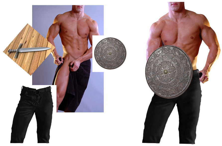
It was decided that we'd just go with the Hero on the cover, so after trawling through the stock sites, I managed to pull the following together. The sword isn't in his hand at this stage, but I'm sure you get the idea ;) Oh, and I've also added some perspective to the targe (shield). Now, for some strange reason I thought that this book was the second in a series. So I originally set the cover up like Prince of the Three Mountains where the Hero was chopped off at the waist by the title banner. Claire quickly set me straight and suggested that perhaps we could use the Hero's full torso in this one.


breakdown-image-1.jpg


Now that I have the Hero partially together, I moved on to the background. The story is set in a Castle on the moors. So with a bit of cutting, pasting & blending .. ta-da .. and we have a castle on the moors. Sometimes I might match the colour of the objects so they blend better but I don't think I did that here. I quite liked the glow that the castle had to it and the lighting on the model seemed to mirror that 'sunlight' effect.


breakdown-image-2.jpg


Next I'll place the images together to get a feel for placement, lighting and suitability. If I'm happy I will continue by adding more detail to the images. The Hero had some Greek blood, hence the dark hair and Greek writing in his tattoo arm band. I've also added the sword by this stage. There was some additional lighting on the model's right shoulder/arm that I didn't want, so I've painted that out. I'll usually then finish off by touching up shadows and highlights.


breakdown-image-3.jpg


Then it's on to the Titles. This is probably where I have the hardest time of it. Deciding where to place the text without detracting from the cover. Sizing, fonts and colours are possibly where I fall down the most. I've only just recently started working on the full cover spread in one document. I used to have one file for the cover, one for the spine and one for the back. While it's taken some getting used to the full spread is probably the easiest to manage. Plus there's less files to have to send to Claire ;) Which I'm sure she is happy about :D

So here we have it. The final full cover spread with titles. :D


the-price-of-a-sword-cover-spread-reduced.jpg


Dreamy Highlanders

Latest 'Coming Soon' covers released over at TEB!

sweet-dreams-cover-reduced.jpg the-price-of-a-sword-cover-reduced.png

Sweet Dreams by Dakota Rebel. I have to admit that I was feeling a little bit of pressure doing this cover. Only because Dakota had put so much trust in me. It is her baby, after all ;) Anyway, the first thing that jumped out at me from the cover request form was the Hero's green eyes. I was having trouble finding the 'right' model so decided to experiment a bit. I'm glad I did. The eyes really do make you feel like the Heroine is being watched over in her dreams. Now for the Heroine, I'd been wanting to use this image for quite some time and it just seemed to fit this cover perfectly. I kept the green colouring right throughout the cover by adding a green silk sheet (originally red). The first cover draft didn't have the textured background but it was a bit stark and boring. So I added some texture and voila! Sweet Dreams :D

The Price of a Sword by Ellie Tremayne. I've actually created a special 'Cover Breakdown' that goes into detail on how this cover was created. Go check out my next post.

Lusty Goddess'

Well, it finally happened. Wednesday I went to finish the Christmas shopping. I get paid on a Wednesday, you see. Anyway, I was so good. I picked up only what was needed as I knew that I had to do the groceries before I went home. So there I am at the grocery checkout and how unusual, the groceries cost more than what I have in my account. Yes, this is quite normal for me. However to save embarrassment I ususally whip out the Mastercard and pay with that. Well, yes you guessed it. This time there was no money available on the Mastercard, I had no extra cash in my wallet (again, not unusual) so I then had to find $84 worth of groceries to hand back. What a bloody nuisance! I really needed the majority of the things that I had to hand back. I don't know how everyone else in the world is finding the finances these days, but christ! $100 does not go very far *sigh*.

I'm so annoyed with myself for letting the Mastercard get away from me like that. I purposely have a low limit because I know how quickly it can build up and I am thankful for that small mercy. So, it seems I've already spent my next couple of Cover cheques LOL! Nothing like getting some enjoyment out of your hard earned cash, eh?

Anyway, enough of my whining ;) 'cause another two covers have been released over at TEB.

tribute-for-the-goddess-cover-artwork-reduced.jpg unholy-lust-cover-artwork-reduced.jpg

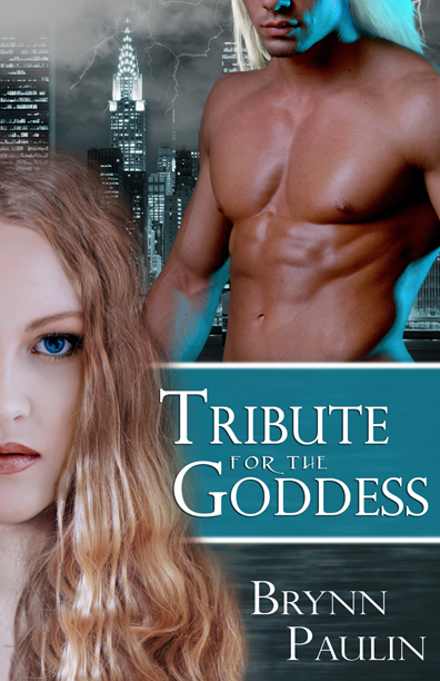
Tribute for the Goddess by Brynn Paulin. This was probably my first real attempt at replacing a model's face. The model with the hair didn't look quite innocent enough, but I'm really happy with how this worked :D I mucked around a bit and was able to re-create a water effect by using textures and motion filters, then added some cloud & lightning brushes for the background. The guy I really liked, except for the lighting, however, I managed to make it look like it belonged there by tinting the background to match the aqua lighting. A couple of hair brushes for him and we were complete! I think this was the second draft. The first had a full body shot of the Goddess. She was holding a flower but I had to paint that out because it was irrelevant to the storyline.

Unholy Lust by Iona Blair. This cover went through a few drafts, trying to get the right feel. I had troubles getting this one for some reason. But that's it. Sometimes no matter how hard you try, the covers don't come together as easily as you'd like. This could possibly be why I've just done the dark background & swirl brushes. I did like the couple though, and was quite intent on using them. Still, all in all it's not too bad ;)

Coming Soon

Hmm .. Prince of the three Mountains Daring the Underworld LOL! Sounds intriguing ;) Okay! These are the latest two covers that have been released over at Total-E-Bound :D

daring-the-underworld-reduced.jpg pottm-cover-artwork-reduced.jpg

Daring the Underworld is second in the Uniform Behaviour series by C.S. Chatterly. I had great fun trying to create fire for this one! It's turned out pretty damn good too LOL! Is it just me or does the guy have a George Clooney look about him?

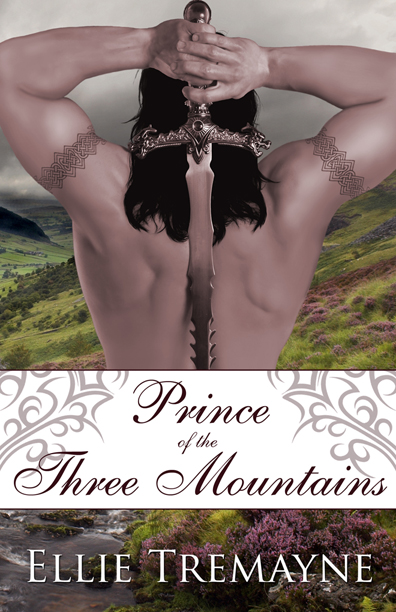
Prince of the Three Mountains by Ellie Tremayne was a bit more time consuming. The original stock photo was cropped off at the biceps and was off-centre. To even him up, I had to paint in his arms/elbows, only to crop them off again for the final cover! LOL. Still, it was a bit of a challenge ;) Don't you just love that background though?

More Covers

Gawd! It's been a while since I've posted anything here. Been busy with covers, courses and family life :D

Here are a couple of covers that have now been released.

broken-pottery-cover-artwork-reduced.jpg conquered-cover-artwork-reduced.jpg tempting-the-law-cover-artwork-reduced.jpg

All very different, eh?

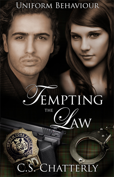
Tempting the Law is probably my favourite in this group. Although Conquered is a very close second ;) Broken Pottery is another in a long series so I'm feeling a little restricted when it comes to these. Still, I must say that it was nice to try something different from the musclebound bodies. Believe me I NEVER thought I would say that! LOL. I was also able to try a few different techniques. I got the idea of the tartan background from April Martinez's wonderful tutorials. It's difficult to see since I've added the gun and cuffs but there are folds and material textures in there somewhere. Its funny how something as subtle as using the Irish Murphy tartan (the character is a Murphy) can make all the difference .. well, to me anyway. I'm sure no-one else will even notice LOL!

Every one of these covers has been a personal little journey of discovery. I absolutely love it! It's the best job that I've ever had.

Most Relevant Cover!!

2007-10-most-relevant-cover.jpg

Wow. I can't believe it!

I've won the October Award for Most Relevant Cover over at The New Covey Awards. It's really nice to be recognised in this field of work, especially considering I'm still a relative newbie.

Congratulations also go to Lexie Davis , the author of Rain Fell Down :D

Thank you to everyone who voted for this cover *hugs*. and thanks to TEB for giving me a go ;) Sheesh! Anyone would think I'd won an Oscar, LOL.