Monday, 7 April 2008

Melting the Minerals

Oh dear .. what a sad day it is for the Australian Film industry. Actor Health Ledger found dead in his NY apartment of an apparent drug overdose. Silly, silly boy *shakes head in disbelief*. He was 28! What a wasted life.

Well I'm not going to dwell on it. He was a bit of a strange one but that was probably the drugs. What a dreadful time it will be for his family and young daughter. It's hard enough dealing with these sorts of things in private, let alone having it all splashed across the world news.

Oh well. RIP Heath! May you have learnt your lessons in this life. Onwards and upwards and all that.

Okay on a lighter note here's the latest cover to grace the pages of TEB's out soon page.
Melting the Minerals

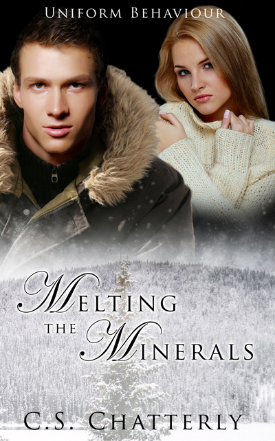
Melting the Minerals by C.S. Chatterly (Book 3 in the Uniform Behaviour series). I really like the style of these covers and have been really happy with how they've all come together. Again this one was quite simple although I did have to add the guy's head to the woolly jacket LOL! I used a similar technique to create the snowy effect as I did for the fire in Daring the Underworld. I just removed the colour :D So there it is, a simple yet effective cover.

Now I also want to congratulate Total-E-Bound on getting 5th place in the P&E awards. 5th out of 107 publishers and they've only been up and running for approx. 6 months! The team at TEB are just so helpful and professional. It's a fantastic team to be involved with so why don't you head on over and check them out!

The TEB Chat over at Nightowl yesterday was fun and very encouraging. Everyone seems really happy with the standard of covers which is great. It's nice to know we're on the right track LOL!

So Dakota was thinking about taking a week off, however, seems her muse has other ideas http://vampsmut.blogspot.com/ and just why is Amarinda walking around the neighbourhood with her clothes on inside out, prey tell? http://amarindajones.blogspot.com/

Cupid and Karaoke

Two more covers released over at TEB ...

karaoke-at-the-tumbleweed-cover-reduced.png cupids-kisses-cover-single-reduced.png

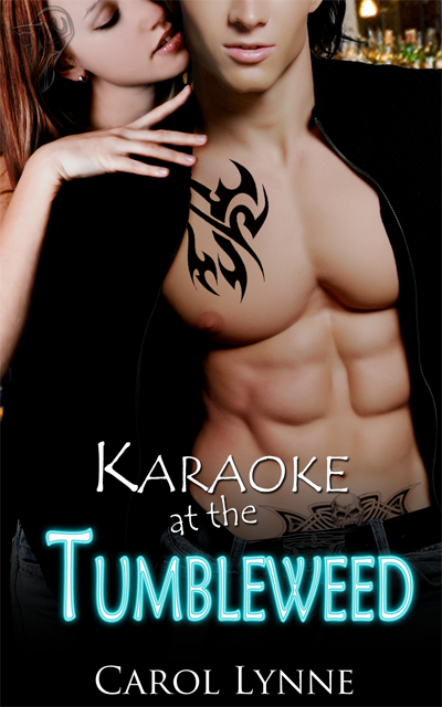
Karaoke at the Tumbleweed by Carol Lynne

Gee, don't you wish all Barmen looked this good?? LOL

This one was needed quite quickly. I had the idea of what I wanted pretty early so it was just a matter of finding the right models. I'd been eyeing these two off for a little while now ... well, one in particular ;), and I'm surprised how well they came together. She was hanging off another fellow but he was wearing too many clothes ;)

Okay, so what have I done here ... I removed the poncy buttons from his cardie and of course added his tatt's and longer hair. I thought she looked a little odd just hanging there with no bottom half so I searched around and found her a hip *rolls eyes*. Yeah, I know I've practically covered it over but I don't like missing body parts ;)

Also her skin was a bit mottled. Actually she looked dead, so I airbrushed a bit of life back into her. I also managed to scratch up a bar/pub background and fussed around with the fonts to get a Neon feel and Voila! Karaoke at the Tumbleweed :D It is a nice change for Carol who usually writes M/M, so I hope she likes it.

The Cupids Kisses covers a couple of short stories - hence the Title & Author. This will cover Dirty Cupid by Lexie Davis, Attitude Adjustment by Bobbie Russell, To Catch a Cassanova by Erika Scott and Redemptions Incubus by Brynn Paulin. The sexy guy with the bow and arrow was pretty straight forward. I went with some rose petals for that Valentines feel. Not one of my better covers but it get's the job done, I guess.

On the count down now. I haven't done any packing. I've been on this computer AAAALLL day. My daughter is thoroughly disgusted with me as she wants to get onto NickJR and play games. Fair dinkum! The house is full of toys. I have one that I'll admit to ;) - my computer. So why am I forever fighting the kids and my husband off the damn thing? It seems that ever since I've become serious about forging a career in Cover Art, which requires endless hours at the computer, all of a sudden everyone else in the household want to get on it? Before I started my cover art no-one came near the bloody thing! Sheesh! Can you tell I'm stressed LOL!

Well, better keep going. Two more covers to try to get done before tonight and then we're off.

Oops .. almost forgot to add that I was interviewed by the lovely Amarinda Jones so go and check out her blog!

Cheers!

Quick Breakdown of The Price of a Sword

Thought I would share with you quickly, how the final cover draft for The Price of a Sword came about.

Okay. So first things first. The Price of a Sword is an Historical, so this in itself was going to limit stock possibilities. You would really think that some forward thinking photographer out there would realise the need for attractive models in period dress. Considering that the publishing industry is a big time user of stock sites. But that is a whole other post and I digress ..

It was decided that we'd just go with the Hero on the cover, so after trawling through the stock sites, I managed to pull the following together. The sword isn't in his hand at this stage, but I'm sure you get the idea ;) Oh, and I've also added some perspective to the targe (shield). Now, for some strange reason I thought that this book was the second in a series. So I originally set the cover up like Prince of the Three Mountains where the Hero was chopped off at the waist by the title banner. Claire quickly set me straight and suggested that perhaps we could use the Hero's full torso in this one.


breakdown-image-1.jpg


Now that I have the Hero partially together, I moved on to the background. The story is set in a Castle on the moors. So with a bit of cutting, pasting & blending .. ta-da .. and we have a castle on the moors. Sometimes I might match the colour of the objects so they blend better but I don't think I did that here. I quite liked the glow that the castle had to it and the lighting on the model seemed to mirror that 'sunlight' effect.


breakdown-image-2.jpg


Next I'll place the images together to get a feel for placement, lighting and suitability. If I'm happy I will continue by adding more detail to the images. The Hero had some Greek blood, hence the dark hair and Greek writing in his tattoo arm band. I've also added the sword by this stage. There was some additional lighting on the model's right shoulder/arm that I didn't want, so I've painted that out. I'll usually then finish off by touching up shadows and highlights.


breakdown-image-3.jpg


Then it's on to the Titles. This is probably where I have the hardest time of it. Deciding where to place the text without detracting from the cover. Sizing, fonts and colours are possibly where I fall down the most. I've only just recently started working on the full cover spread in one document. I used to have one file for the cover, one for the spine and one for the back. While it's taken some getting used to the full spread is probably the easiest to manage. Plus there's less files to have to send to Claire ;) Which I'm sure she is happy about :D

So here we have it. The final full cover spread with titles. :D


the-price-of-a-sword-cover-spread-reduced.jpg


Dreamy Highlanders

Latest 'Coming Soon' covers released over at TEB!

sweet-dreams-cover-reduced.jpg the-price-of-a-sword-cover-reduced.png

Sweet Dreams by Dakota Rebel. I have to admit that I was feeling a little bit of pressure doing this cover. Only because Dakota had put so much trust in me. It is her baby, after all ;) Anyway, the first thing that jumped out at me from the cover request form was the Hero's green eyes. I was having trouble finding the 'right' model so decided to experiment a bit. I'm glad I did. The eyes really do make you feel like the Heroine is being watched over in her dreams. Now for the Heroine, I'd been wanting to use this image for quite some time and it just seemed to fit this cover perfectly. I kept the green colouring right throughout the cover by adding a green silk sheet (originally red). The first cover draft didn't have the textured background but it was a bit stark and boring. So I added some texture and voila! Sweet Dreams :D

The Price of a Sword by Ellie Tremayne. I've actually created a special 'Cover Breakdown' that goes into detail on how this cover was created. Go check out my next post.

Lusty Goddess'

Well, it finally happened. Wednesday I went to finish the Christmas shopping. I get paid on a Wednesday, you see. Anyway, I was so good. I picked up only what was needed as I knew that I had to do the groceries before I went home. So there I am at the grocery checkout and how unusual, the groceries cost more than what I have in my account. Yes, this is quite normal for me. However to save embarrassment I ususally whip out the Mastercard and pay with that. Well, yes you guessed it. This time there was no money available on the Mastercard, I had no extra cash in my wallet (again, not unusual) so I then had to find $84 worth of groceries to hand back. What a bloody nuisance! I really needed the majority of the things that I had to hand back. I don't know how everyone else in the world is finding the finances these days, but christ! $100 does not go very far *sigh*.

I'm so annoyed with myself for letting the Mastercard get away from me like that. I purposely have a low limit because I know how quickly it can build up and I am thankful for that small mercy. So, it seems I've already spent my next couple of Cover cheques LOL! Nothing like getting some enjoyment out of your hard earned cash, eh?

Anyway, enough of my whining ;) 'cause another two covers have been released over at TEB.

tribute-for-the-goddess-cover-artwork-reduced.jpg unholy-lust-cover-artwork-reduced.jpg

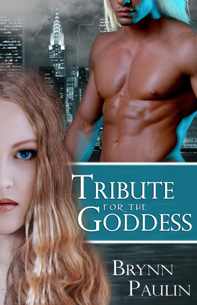
Tribute for the Goddess by Brynn Paulin. This was probably my first real attempt at replacing a model's face. The model with the hair didn't look quite innocent enough, but I'm really happy with how this worked :D I mucked around a bit and was able to re-create a water effect by using textures and motion filters, then added some cloud & lightning brushes for the background. The guy I really liked, except for the lighting, however, I managed to make it look like it belonged there by tinting the background to match the aqua lighting. A couple of hair brushes for him and we were complete! I think this was the second draft. The first had a full body shot of the Goddess. She was holding a flower but I had to paint that out because it was irrelevant to the storyline.

Unholy Lust by Iona Blair. This cover went through a few drafts, trying to get the right feel. I had troubles getting this one for some reason. But that's it. Sometimes no matter how hard you try, the covers don't come together as easily as you'd like. This could possibly be why I've just done the dark background & swirl brushes. I did like the couple though, and was quite intent on using them. Still, all in all it's not too bad ;)

Coming Soon

Hmm .. Prince of the three Mountains Daring the Underworld LOL! Sounds intriguing ;) Okay! These are the latest two covers that have been released over at Total-E-Bound :D

daring-the-underworld-reduced.jpg pottm-cover-artwork-reduced.jpg

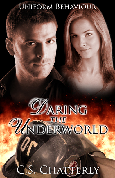
Daring the Underworld is second in the Uniform Behaviour series by C.S. Chatterly. I had great fun trying to create fire for this one! It's turned out pretty damn good too LOL! Is it just me or does the guy have a George Clooney look about him?

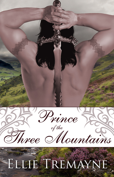
Prince of the Three Mountains by Ellie Tremayne was a bit more time consuming. The original stock photo was cropped off at the biceps and was off-centre. To even him up, I had to paint in his arms/elbows, only to crop them off again for the final cover! LOL. Still, it was a bit of a challenge ;) Don't you just love that background though?

More Covers

Gawd! It's been a while since I've posted anything here. Been busy with covers, courses and family life :D

Here are a couple of covers that have now been released.

broken-pottery-cover-artwork-reduced.jpg conquered-cover-artwork-reduced.jpg tempting-the-law-cover-artwork-reduced.jpg

All very different, eh?

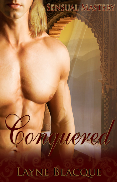
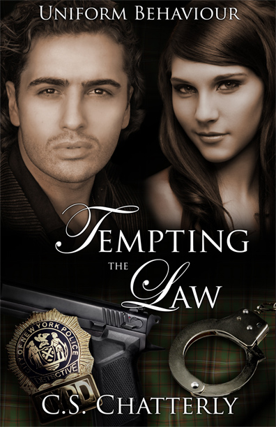
Tempting the Law is probably my favourite in this group. Although Conquered is a very close second ;) Broken Pottery is another in a long series so I'm feeling a little restricted when it comes to these. Still, I must say that it was nice to try something different from the musclebound bodies. Believe me I NEVER thought I would say that! LOL. I was also able to try a few different techniques. I got the idea of the tartan background from April Martinez's wonderful tutorials. It's difficult to see since I've added the gun and cuffs but there are folds and material textures in there somewhere. Its funny how something as subtle as using the Irish Murphy tartan (the character is a Murphy) can make all the difference .. well, to me anyway. I'm sure no-one else will even notice LOL!

Every one of these covers has been a personal little journey of discovery. I absolutely love it! It's the best job that I've ever had.